JS Doc
Current version:
Our Search By Color widget enables your site to find products based on a selected color. There are 4 components within this widget:
- Color search button.
- Preview box to display the selected color with a color picker to allow further search.
- Filter list which can be used to further refine search results.
- Result box to display the search results.
Setup
You can directly place our script into your page header to access this widget:
<script type="text/javascript" src="//cdn.visenze.com/visearch/dist/js/components/-.bundle.js"></script>
Quick start
This quick start guide demonstrates how to load and initialize our ViSenze **** widget. This guide uses basic options to initialize the widget. However, you can also customize advanced options if you want to do so.
Setup the Widget
2 simple steps to integrate our widget:
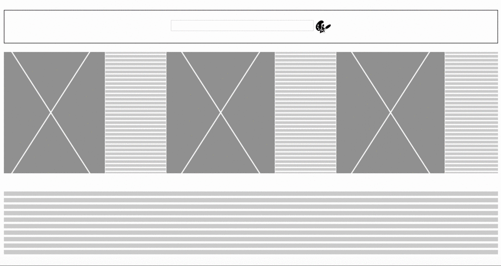
Place the elements
This widget contains four elements. You should place the elements needed by this widget somewhere in your html body and assign an ID for each of them. In our example, we have the layout as:
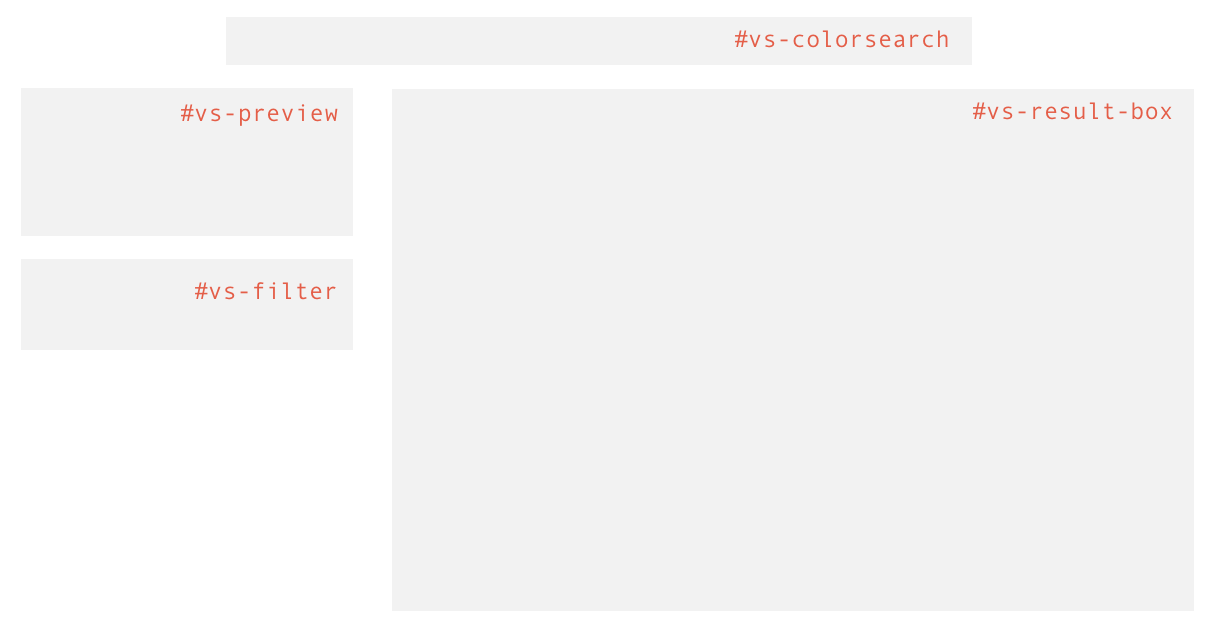
You can find the following source code in src/colorsearch/index.html:
<body>
    <div class="container">

        ...

        <div class="col-xs-12 dummy-ele search" >
          <div class="search-box"><input type="text" class="search-text" /></div>
          <div id="vs-colorsearch"></div>
        </div>

        ...

        <div class="col-xs-12">
            <div class="col-md-3 col-xs-12">
                <div id="vs-preview"></div>
                <div id="vs-filter"></div>
            </div>
            <div class="col-md-9 col-xs-12">
                <div id="vs-result-box"></div>
            </div>
        </div>

        ...

    </div>
</body>
Initialize the widget
To get real data working in the example, you need to initialize the following code snippet. The customizable parameter object contains three sub-objects:
vsSettings: parameters to customize the search options
displaySettings: parameters for presentation
colorSearchOpts: parameters of the product
You can find the following code snippet in src/js/colorsearch.js:
var vsSettings = {
  appKey: 'APP_KEY',
  fl: ["im_url", "price", "title", "product_url", 'brand', 'category', 'discount_price'],
  limit: 15
};

var displaySettings = {
  totalNumProducts: 50,
  hasTopPagination: true,
  cardsPerRow: 3,
  filterTitle: "Filter by"
};

var filterList = [
  {
    title: 'Categories',
    type: 'category',
    schema: 'category',
    style: "check-box"
  },
  {
    title: 'Price',
    type: 'price',
    schema: 'price',
    style : 'range-bar'
  }
];

var onChange = function(value) {
  if(value.status == "OK") {
    $('.dummy-ele').css('display', 'none');
  }
}

var colorSearchOpts = {
  productDetails: {
    heading: 'title',
    productUrl: 'product_url',
    label: 'brand',
    price: "price",
    discountPrice: "discount_price"
  },
  filters: filterList,
  searchTitle: "Color search results",
  hasHoverCartIcon: true,
  hasStaticCartIcon: false,
  hasHoverFindSimilar: true,
  hasStaticFindSimilar: false,
  findSimilarText: "Find similar",
  onQueryComplete: onChange
};

var options = {
  vsSettings: vsSettings,
  displaySettings: displaySettings,
  colorSearchOpts: colorSearchOpts
}

$(document).ready(function() {
    ColorSearch(
        document.getElementById("vs-colorsearch"),
        document.getElementById("vs-filter"),
        document.getElementById("vs-result-box"),
        document.getElementById("vs-preview"), options);
});
Please update the following parameters in the code snippet according to your own app configurations:
| Parameters | Explanation |
|---|---|
APP_KEY |
This is the credential to call our API. You should be able to find these in the Integration/Client-side Integration section on dashboard. Detailed explanation on key pairs can be found here. |
SCHEMA_NAME |
The corresponding schema field values to be linked. The value of the schema should be the one that is being configured in your schema setting. You can find the full list in the Your Images -> Schema section on dashboard. Detailed explanation on schema configuration can be found here. |
Run the example
The example project is managed by gulp.
If you don't have gulp, please follow the getting started guide to install it.
The following command will start a server and run the example at http://localhost:8080:
// Remember to configure before starting or else there will be error
gulp start
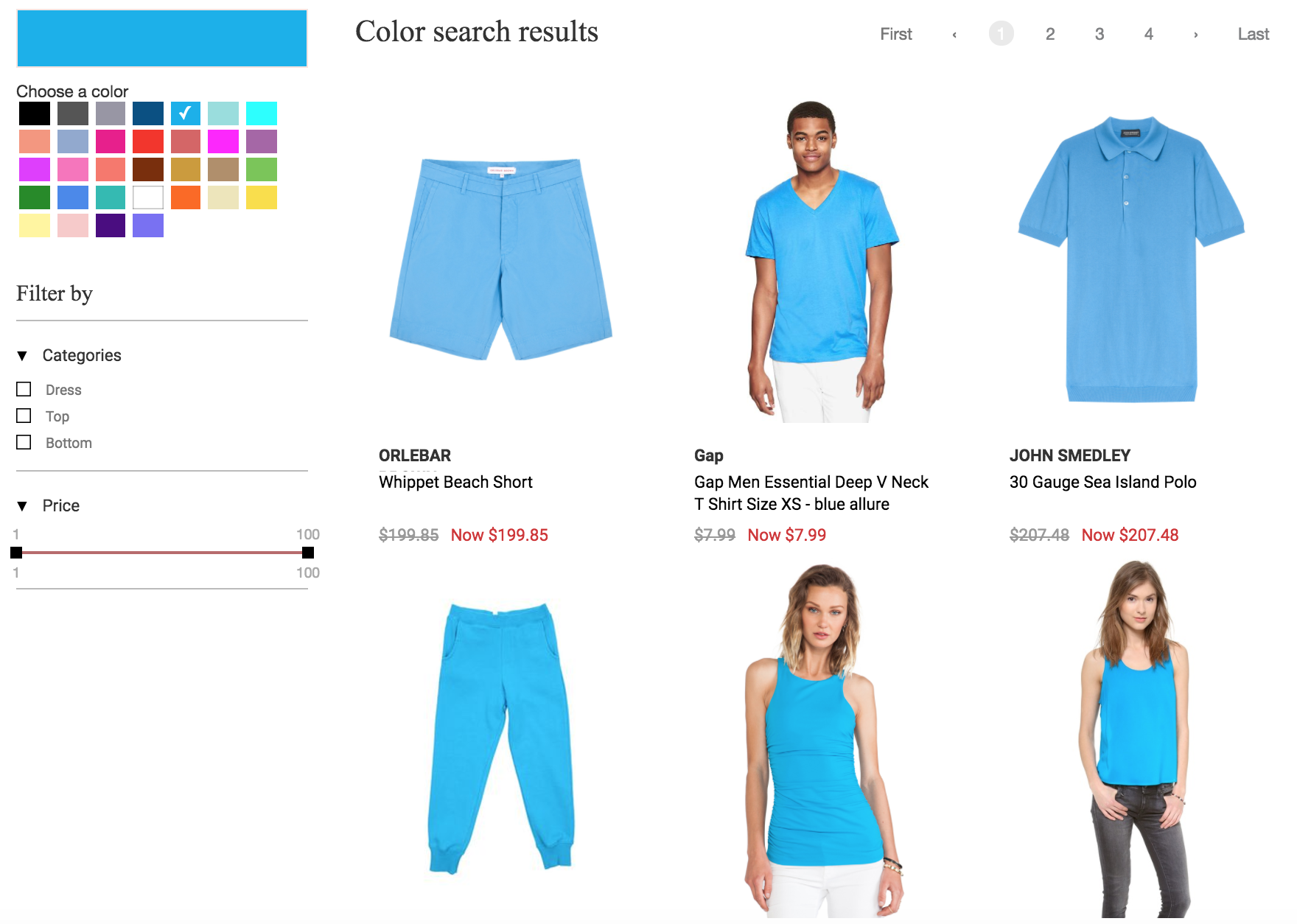
If the parameters are configured correctly, you should be able to see the widget working like this:
Advanced options
Customize product card layout
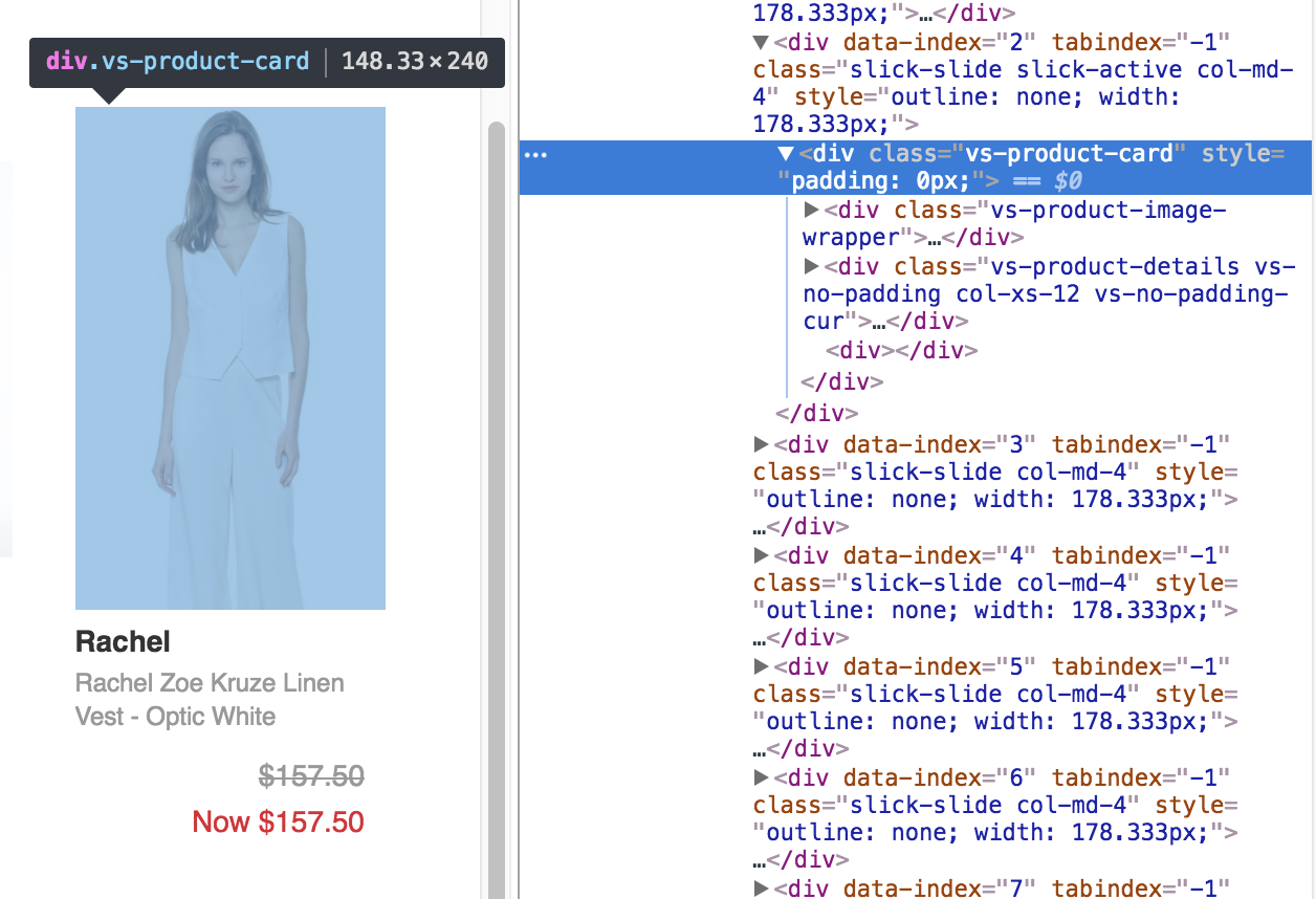
You might want to customize the layout of the product card to fit the design of your site.
productDetails is an object that maps the corresponding card details to search results.
The image below illustrates a visual representation of the product card and its details.
You can pass the field schema value to the placeholder in order for the correct value to be rendered.
Note that the widget will not render the product detail field unless it is set.
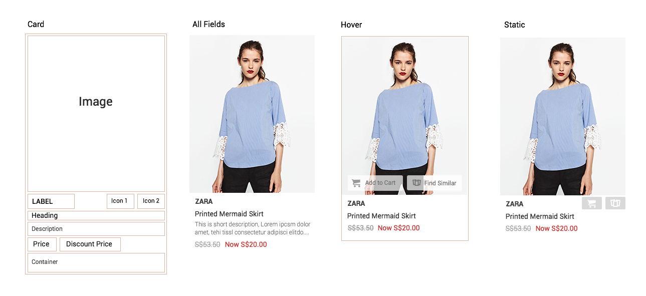
Example: Configure productDetails as shown below in order to display the product title first and product brand below that:
  productDetails: {
    label: "title",
    heading: "brand",
    description: "",
    price: "price",
    discountPrice: "discount_price"
  }
Customize product card style
Of special interest is the ability to customize the style of the widget so it matches the look and feel of your website. The widget is made of up multiple JavaScript elements which can be modified by adding CSS styling to your site.
You can find the sample css files to customize the look for the example in the directory src/styles.
Here is sample css that customizes the product card layout as shown above:
/*Product details*/
.vs-product-details {
  color: #333333;
  font-size: 14px;
  padding-top: 5px;
  padding-bottom: 5px;
  font-family: 'Roboto-Regular', sans-serif;
}
.vs-product-details .vs-ellipsis {
  -webkit-line-clamp: 2;
  -webkit-box-orient: vertical;
  text-overflow: ellipsis;
  overflow: hidden;
}
.vs-product-details .vs-elli-one {
  -webkit-line-clamp: 1;
}
.vs-product-details .vs-product-label {
  height: 22px;
  font-family: 'Roboto-Bold', sans-serif;
}
.vs-product-details .vs-product-heading {
  position: relative;
  line-height: 1.4em;
  height: 40px;
}
.vs-product-details .vs-product-description {
  font-size: 12px;
  height: 35px;
  font-family: 'Roboto-Light', sans-serif;
  color: #777777;
}
.vs-product-details .vs-product-price {
  display: inline-block;
  margin-top: 5px;
  margin-bottom: 5px;
  margin-right: 10px;
}
.vs-product-details .vs-strikethrough {
  text-decoration: line-through;
  color: #999999;
  font-weight: 400;
}
.vs-product-details .vs-product-discount-price {
  display: inline-block;
  color: #d03535;
  font-weight: 400;
}
.vs-product-details .vs-product-more_details {
  color: white;
  text-align: center;
  background-color: black;
  line-height: 30px;
}
.vs-product-details .vs-product-more_details:hover {
  color: white;
  text-decoration: none !important;
  background-color: #676767;
}
.vs-product-details .vs-cart-static {
  height: 20px;
  width: 20px;
  margin-left: 15%;
  cursor: pointer;
  opacity: 0.7;
  float: right;
}
.vs-product-details .vs-cart-static:hover {
  opacity: 1;
}
.vs-product-details .vs-cart-icon {
  height: 100%;
  width: 100%;
}
Customize filters layout
You can config the filters component to display your customized search filters:
var filters = [
    {
      title: "TITLE_OF_FILTER",
      type: "one of the supported", //currently support: "category", "price", "gender"
      style: "one of the supported", //currently support: "check-box", "range-bar"
      schema: "MAP_TO_SCHEMA", //mapping to the schema field
    }
  ]
example:
var filters = [
  {
    title: 'Categories',
    type: 'category',
    schema: 'vi_category',
    style: "check-box"
  },
  {
    title: 'Gender',
    type: 'gender',
    schema: 'gender',
    style: 'check-box'
  },
  {
    title: 'Price',
    type: 'price',
    schema: 'price',
    style : 'range-bar'
  }
];
Reference
vsSettings
| Key | Type | Description |
|---|---|---|
| appKey | string | (compulsory) app key |
| fl | array | (compulsory) list of schema values returned from the API. The lists need to match the schema set in the API. |
| fq | object | (optional) list of pre-defined filters to filter your search results. e.g. fq: ['country:singapore', 'brand:nike']. Detailed explanation of the filters can be found here. |
| limit | integer | (optional) the number of search results returned. Default set to 15. |
colorSearchOpts
| Key | Type | Description |
|---|---|---|
| onQueryComplete | function | (compulsory) a callback function when the query is completed. The response will be an object like this {status : "OK"}. |
| productDetails | object | (compulsory) result in widget mapped to the product card display. See below for product card layout. Each of the card elements will be matched to the response result. Widget will not render the card element if the key is not given. |
| filters | array | (optional) array of objects. Each object describes filter field and display options. Setting the filters will turn on search facet filter and a list of filter items will be returned. See an example. |
| searchTitle | string | (optional) title of the widget to be displayed. Default is set as "Search results". |
| productContainer | html element | (optional) area for additional customization on top of the default layout provided. Recommended to have simple additional buttons. |
| onProductContainerClicked | function | (optional) method to be executed when the productContainer is clicked. |
| hasHoverCartIcon | boolean | (optional) show the "Add to cart" icon when image is hovered over. Default set to true. See an example. |
| hasStaticCartIcon | boolean | (optional) show the "Add to cart" icon permanently below the image. Default set to false. See an example. |
| onAddToCartClicked | function | (optional) method to be executed when "Add to cart" icon is clicked. |
| cartText | string | (optional) text to represent "Add to cart". Default set to "Add to cart". It will always show to the right of the icon. |
| afterCartText | string | (optional) text to represent "Add to cart" after clicked. Default set to "Added". It will always show to the right of the icon. |
| findSimilarText | string | (optional) add a text description on the right of the "Find Similar" icon (applicable to only the hover button). Default is empty. |
| hasHoverFindSimilar | boolean | (optional) show the "Find Similar" icon when image is hovered. Default set to true. See an example. |
| hasStaticFindSimilar | boolean | (optional) show the "Find Similar" icon permanently below the image. Default set to false. See an example. |
displaySettings
| Key | Type | Description |
|---|---|---|
| filterTitle | string | (optional) title for the filter. Default set to "Filter by". |
| totalNumProducts | integer | (optional) total number of results to be shown. Default set to 100. |
| hasTopPagination | boolean | (optional) show pagination on top of search result. Default set to false. |
| hasBottomPagination | boolean | (optional) show pagination at the bottom of search result. Default set to true. |
| hasBoundaryLinks | boolean | (optional) to show the first and last page button. Default set to true. |
| hasNext | boolean | (optional) to show next button. Default set to true. |
| hasPrev | boolean | (optional) to show previous button. Default set to true. |
| cardsPerRow | integer | (optional) number of product results to be shown per row in the scroll box. Default set to 3. |
| hasQueryProduct | boolean | (optional) show the details of the query product within "Find Similar". Default set to false. Note that query product details is automatically mapped to the query product. |
| currencySymbol | string | (optional) currency symbol before prices and discount_prices. Default set to '$'. |
| errorMessage | string | (optional) message to be displayed when an error occurs. Default set to "System busy. Please try again later". |